How To Create Consistent Brand Messaging

What makes one brand memorable while another fades into the background? More often than not, it’s consistent brand messaging. Brands that speak with a unified voice across every touchpoint (from social media and website design to packaging and socials) build trust, recognition, and loyalty with their audience.
But how do you create that consistency in your brand messaging? And what happens when it's missing? Let's dive in.
How to Create Consistent Brand Messaging
Here’s a step-by-step process to get your messaging aligned across the board:
1: Define your brand core
Start with the big picture of your brand strategy. To create a brand strategy, start with:
- Mission: Why does your brand exist?
- Vision: Where are you going?
- Brand values: What brand values do you stand for?
- Personality: If your brand were a person, how would it speak and behave?
-
2: Create brand voice guidelines
Brand guidelines can include your tone (e.g. warm, witty, professional), key phrases or words you always use, and phrases you avoid. Having professional brand guidelines in writing ensures your whole team stays aligned, keeping your brand consistent in its voice across all your marketing channels.
3: Establish messaging pillars
These are the 3-5 key messages or themes you always come back to. For example, if you’re a sustainable skincare brand, your pillars might be: eco-conscious ingredients, cruelty-free testing, and transparency in supply chains.
4: Align visual brand identity
To align your visual brand identity across the board, your colours, fonts, logo usage, and design style should all support brand consistency by reinforcing your brand message. Don't let visuals contradict your words. Visual brand consistency is one of your most useful brand assets.
5: Audit and adapt across channels
Review your website, social media platforms, email marketing, ads, packaging, and customer service scripts to make sure your messaging stays cohesive.
An omnichannel customer engagement platform can help unify these touchpoints, allowing you to deliver consistent, personalized experiences across every channel and better track customer interactions.
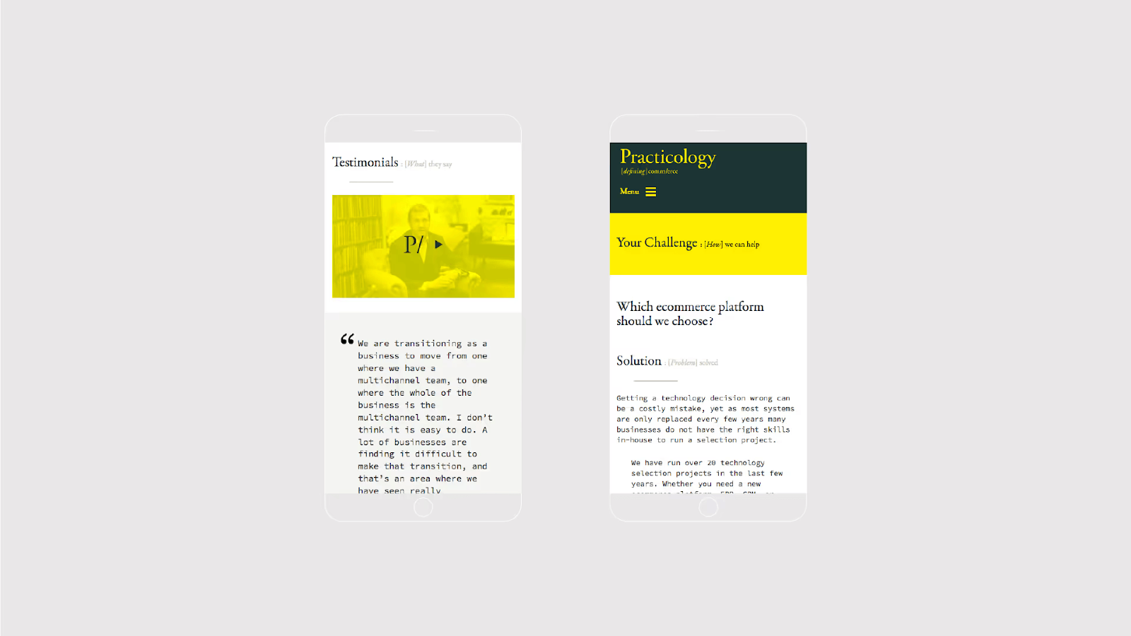
Creating a unique visual language for Practicology
What Is Consistent Brand Messaging?
Consistent brand messaging means communicating the same core values, tone of voice, visual identity, and messaging pillars across all platforms and channels. Whether a customer sees your Instagram post, reads your email, or visits your website, they should instantly know it’s you by your consistent brand identity and brand personality.
It’s not just about logos and colour schemes, though those do matter. It’s about your brand story, your tone of voice, your values, and how you show up repeatedly and reliably in every interaction. That's how you build real brand recognition with your target audience.
Whether you’re just starting out or refreshing your brand, take time to align your voice, visuals, and values across the board.
See Also: Why You Need Brand Messaging Before Copywriting
Why is consistent messaging important in marketing?
Consistency isn't just a buzzword. It has real, measurable benefits:
- Builds trust: Customers know what to expect and feel more secure choosing you.
- Enhances recognition: Repetition of visuals, language, and messaging helps your brand stand out.
- Improves perceived professionalism: Brands that are inconsistent can appear disorganised or untrustworthy.
- Strengthens emotional connection: A consistent message supports a coherent brand narrative, which makes it easier for customers to emotionally connect.
See Also: Why Is Brand Messaging So Important?
Brand Consistency Examples (Done Right)
Let’s look at a few brands that have nailed consistent brand messaging:
HubSpot
HubSpot’s tone is approachable, confident, and always focused on growth. Whether you're browsing a blog post, watching a tutorial, or setting up your CRM, HubSpot has a consistent brand image that makes the experience feel seamless and familiar. Their messaging consistently revolves around education, empowerment, and business success, and their visual branding supports this with clean design and bold, warm colours.

Xero
Xero’s tone is simple, warm, and jargon-free, which is exactly what busy business owners and accountants need. Their website, dashboard notifications, help centre, and social media all use the same straightforward language and friendly design. They also stay consistent in their visual identity: clean interfaces, calming colours, and clear typography.

Innocent Drinks
Innocent Drinks have a cheeky, friendly and innocent tone that is instantly recognisable, from bottle labels and their website, through their Twitter (now X) replies. They even consistently monitor follow up comments and take action to correct campaigns that take an unexpected turn. Their charity work further reflects the brand’s ethical, kind and caring persona.


Examples of Poor Brand Consistency
Even well-known brands sometimes miss the mark. Whether it's due to rapid growth, poor internal alignment, or simply trying to be too many things at once, these examples show what happens when consistency slips, as well as what we can learn from it. Here’s what not to do:
Mixed messaging
Mixed messages with conflicting values undermines brand credibility. One clear example of mixed messaging during a rebrand is with global giant Meta. The pivot from Facebook to Meta was bold, but also confusing. While the parent company rebranded to position Meta as an innovation leader in the metaverse, the flagship platform stayed the same, creating mixed messaging.
The brand voice also became fragmented: visionary in Meta’s PR, defensive on Facebook, and inconsistent across other apps and marketing channels like Instagram and WhatsApp.

Seen on a video screen in Sausalito, Calif., Facebook CEO Mark Zuckerberg announces his company’s new corporate name, Meta, during a virtual event in 2021. (Eric Risberg / Associated Press, via LA Times)
Inconsistent tone
A disconnect between different channels can confuse your audience at best and erode trust at worst. One illustrative example of this is Sears, once a US retail giant, which lost relevance partly due to its inconsistent brand evolution.
As ecommerce boomed, Sears struggled to modernise. Their messaging failed to evolve or unify: some ads leaned into nostalgia, others tried to seem modern, and their website design lagged behind competitors. The result? A confused audience and a weakened presence followed by a file for bankruptcy in 2018, with almost all Sears stores now closed.
Visual disarray
Changing your logo, colours, or typefaces frequently, or failing to apply them consistently, can dilute your brand identity. One example of visual disarray in brands is Yahoo, which has struggled for years with brand identity.
From constant logo changes (over a dozen in two decades) to disjointed product experiences and clashing visual elements across its platforms, the brand often feels like a patchwork which makes it hard to know what Yahoo stands for today.

Final Thoughts
While critical, keeping everything consistent isn’t always easy. Between multiple platforms, evolving messaging, and fast-moving teams, it’s easy for things to slip through the cracks. That’s where Huddle comes in.
Our branding services are designed to bring clarity, cohesion, and creativity to your business identity. Whether you need a full brand strategy from scratch, a brand identity refresh that aligns your existing assets, or a professional set of brand guidelines to guide future efforts, we can help.
Brief us today