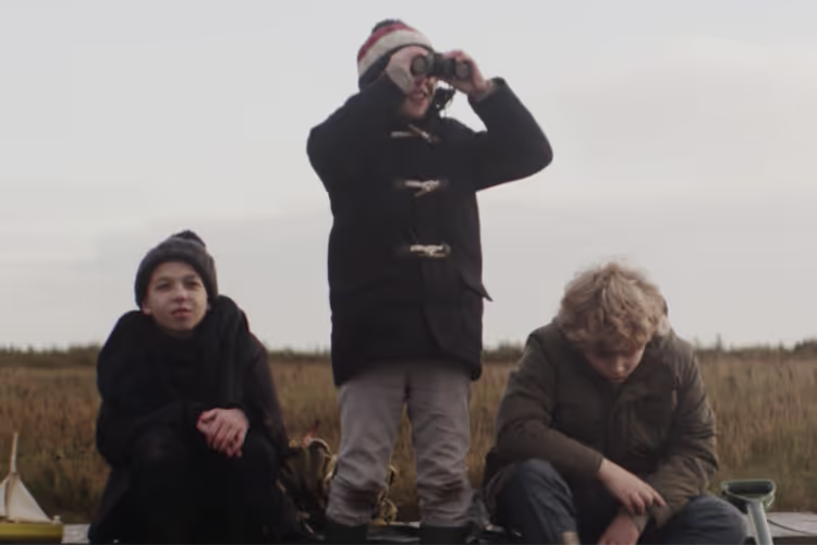
Hope and Homes for Children is a British registered charity operating and working with children, their families and communities in several countries in Central and Eastern Europe and Africa, to help children grow up in safe and productive environments. Since 1994, Hope and Homes for Children have worked to stop the institutionalisation of children and to close the doors of orphanages forever in every country in the world. They fight for every child to feel the love and belonging of a safe family home.
Huddle was excited to work with such a purpose-driven client, using our highly collaborative and agile approach.


The brief
HHC approached Huddle when they were currently developing the Hope and Homes for Children brand. They were working with brand and language specialists to refresh, enhance and simplify their personality, tone of voice and messaging and were looking to partner with a creative agency to support the development of the visual expression of their emerging brand.


The brief
They needed the new brand identity to:
- Increase awareness of their cause and support for their mission
- Cut through the noise and distraction of the crowded marketplace in which they have to compete for financial support
- Match the boldness and energy that donors love about their people
- Align with their new bolder, less apologetic ToV
- Help them achieve their big ambition – to end the use of orphanages as a way to care for children, in every country in the world.


What did we deliver?
- Additional big ideas to propel your refreshed brand and marketing efforts
- Multiple visual and messaging concepts based on agreed territories to explore
- Comprehensive style guide capturing all brand visual identity components for development in-house.
- Art direction and creative advice throughout the duration of the project
- Development of chosen territory to include all related brand assets, such as Logo markTagline - Key messaging - Colour palette - Typography - Iconography - Photography style - ToV principles
- Design of visual mockups, including templates - Reports - Presentations - Key website pages - Event assets


What did we deliver?
Sprint 1: Immersion + Strategy Co-Creation Session
Sprint 2: Initial Exploratory Visual and Messaging Concepts
Sprint 3: Development of Selected Direction
Sprint 4: Final Branded Mockups + Style Guide


Challenges we overcame and result
The main challenges we had to overcome for this client were around their desired ToV. They wanted to move away from a quiet, timid and apologetic ToV. HHC wanted the brand to feel bold, confident, disruptive and surprising. And their new visual identity needed to represent that change. We delivered this. Another big challenge our team overcame was to keep the long name in: ‘Hope and Homes for Children’. HHC wanted a brand that truly changed the common narrative and highlighted HHCs mission while still keeping the brands identity.
With our creative rebrand, they’ve gained more support, more funds, and have cut through the noise so that people hear their message – now their brand speaks from the heart of who they are as an organisation. They have since been shortlisted for Third Sector Awards in the "Excellence in Brand Development" category.
Request your free Blandscape™ scorecard
Request your free brand scorecard
Discover the truth about how your brand comes across. Get your free Blandscape™ audit with scores for 10 key elements, from strategy to storytelling to design.


